Designs for Thought
Everybody has that one friend who's always trying to hack their productivity. For me, that friend is Andy.
Andy is the type of guy who obsessesively logs his meals and meticulously tracks his sleep. He's experimented with keto and intermittent fasting. He loves his Eight Sleep mattress and Oura Ring. And every week, Andy has a new note-taking system.
One day, Andy posted about Roam. I was at an exploratory phase in life and my curiosity was piqued, so I decided to check it out.
I have to say I was pretty skeptical going in–new note-taking apps seem to become 'in vogue' and then fade on a predictable cycle.
But Roam (and now Obsidian) changed my mind. They have completely altered the way I go about my day.
If you're concerned that this will be a puff piece, don't be. This isn't a tools-for-thought fanboy post.
Instead, I'd like to dig into a handful of the little design decisions that make Roam a really novel product.
This is important because we've had the computing power, network stack, and all the software we'd need to build these tools for thought for decades. It's all just files, markdown, and a basic UI.
It's not entirely clear to me why it took so long for us to build these sorts of tools. But what is clear is that we need to do more of it (more on that later).
Judging a book by its cover
I took too long to give Roam a shot because the UI looks... kind of ugly?
Odd typography, uneven spacing, bulletpoints and brackets everywhere. What even is this tool?
But in many ways, Roam is actually quite well-designed. Just not designed to be looked at.
Roam is designed to be engaged with. Each part of the interface silently nudging you to write a little more, and put down a few more connections.
That's no accident. There's a ton of small features that add up to a transformational experience.
Time-based vs subject-based
Most note-taking tools either focus on being time-based (a journal that has one new entry per day) or subject-based (let me create a new Notion page for each project).
Critically, you have to choose which approach you prefer! Most note-taking apps require that you buy into one approach or the other... but you can't do both!
Here's the problem though: I'll often have uncategorized musings that pop up from day-to-day across all variety of subject matter (e.g. I read an interesting blog post on culture, or a friend told me about the obesity epidemic). At the same time, I'll have highly structured 'streams' of projects (what are the next steps on the Heat Pump calculator I'm building?).
With most notetaking apps, before I start writing anything, I have to figure out where my writing should go! Sometimes I lose the thought before I even start a new note.
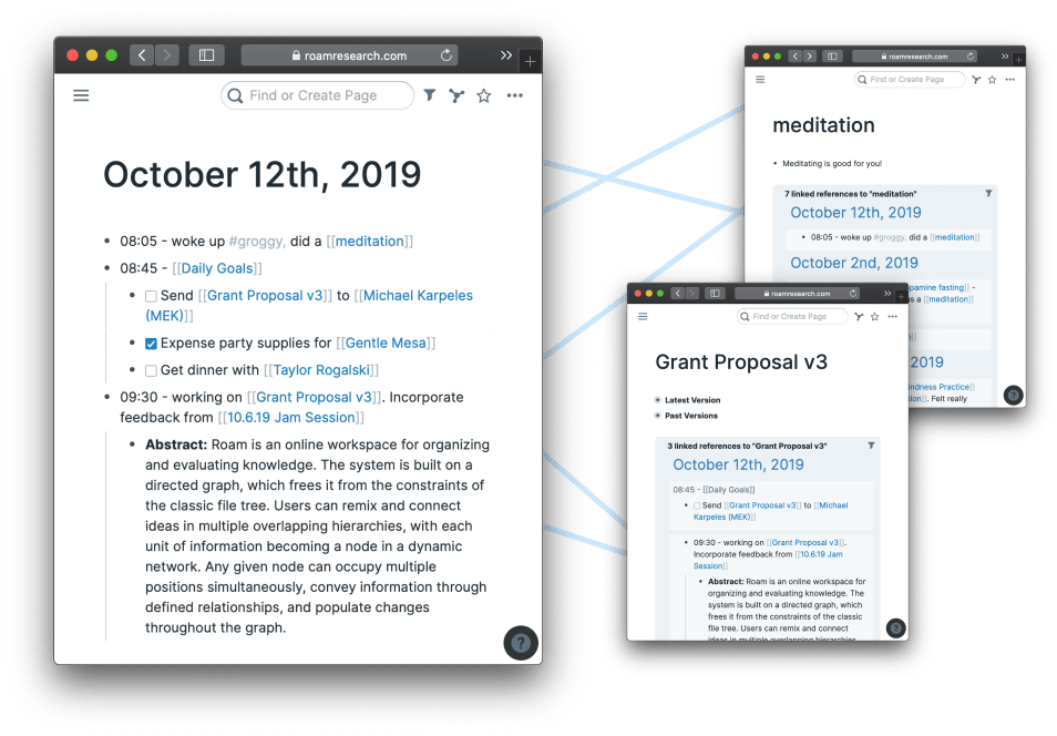
Roam's default view gives me a new time-based note every single day. It's the default 'homepage' where I'll start cataloging my day.
Down below, yesterday's note is right there. I don't even have to 'reach for the note' to see what I was doing yesterday. It's already right there in front of me.
This does two things:
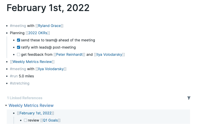
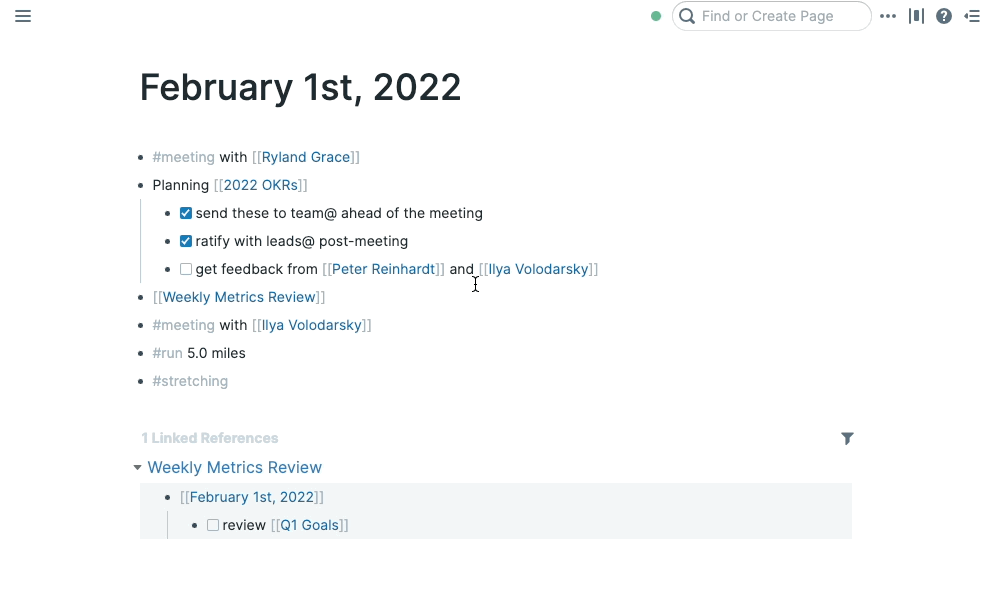
- It's easy to see what I was doing on a particular date (I can jump straight to the February 1st, 2022 note)
- It's easy for me to scroll back in time to get context on what I was just doing recently.
In short, it's the best of both worlds: I can still jump to a particular day, and it feels like it's part of a long-running note. But I can also jump into an individual idea or topic as I see fit.
The nice thing about these subject-based notes is that they feel very free. I don't have to worry about losing them because I can search for them, or find them temporally.
The 'blank page' problem
Most note-taking apps don't do anything to help you start taking a note. Here's what the Apple Notes interface looks like.
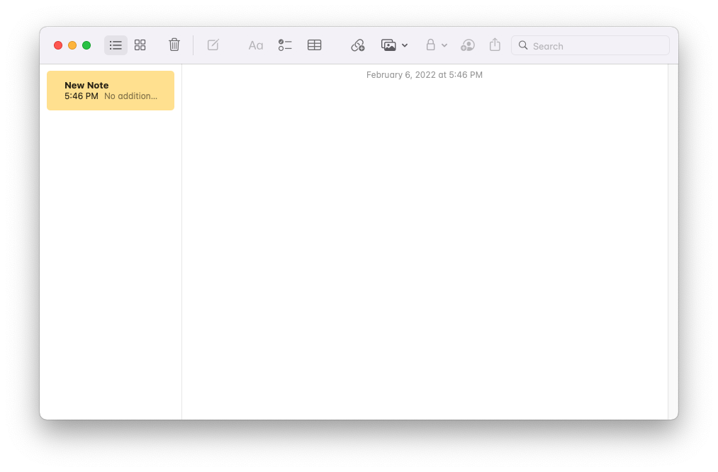
It's pretty... bare. There's not a lot here that's encourage me to write.
Roam does a few very clever things to solve this. I already touched on the 'daily notes', but every day there's a new note which is prompting me to start writing. [1]
What's more, any time you write a line and hit 'enter', a new line appears. But that new line isn't so daunting that it's totally free form and blank. Instead, a helpful bullet has appeared waiting for your input.

I used to hate the bullets, until I realized how much new information I was adding because of them.
Something about bulleted writing feels less scary, and more information dense. It encourages work-in-progress thoughts that can be edited later.
Losing context
Another big issue I have with most tools (note-taking, browsers, etc) is that I tend to perform an action that makes me lose context about what I was doing in the first place.
A good example is when I'm going to look up someone's contact info on LinkedIn. I'd guess that about 30% of the time, I'm immediately distracted by the feed and forget for a moment why I'm there. [2]
Roam solves that by letting you open notes "in-context". If you shift+click a given page that you've linked to, it will open up in the 'sidepane'.
What's great about this is that you can edit either pane, and continue to keep the flow of your thoughts. There's no losing flow state as you switch tabs.
Progress
Another area most note-taking tools miss out on is that they don't give you any feeling of 'progress'. There's not a ton of incentive to add more to what you already have.
Contrast that to Roam: there's a view that shows you every single connection you've made. If you've seen any marketing material of the tool, you've probably seen it. Here's my Obsidian graph:
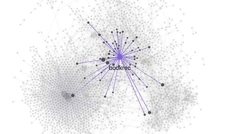
Now, the graph is basically useless. I never look at it on a daily basis at all. But it does give me one thing: a sense of progress.
The more I write, the more intricate and exciting my graph looks. It feels like I'm getting smarter just by writing. Every few months, I can check back in with it.
Connections in Roam and Obsidian aren't just more visible, it's easier to make them too.
Instead of a bunch of nested sub-menus and button presses, it's 4-5 keystrokes (double bracket, some lines of the connection you'd like to make, enter).
Connections are useful in a second way: they make me feel like I'm doing "behavior-driven development".
Instead of going through 2-3 step workflow to create a new note and typing it out, I'll start my day by creating the stubs of all the writing I'd like to do (right in-line of what I'm doing), and then fill them in over the course of the day.
UI makes the difference
I'd like to close with a broader thought around why any of these little UI patterns matter.
Think about text editors writ large. They have existed the dawn of computing. Vi was created 46 years ago. But up until the last few years, these sorts of 'networked tools for thought' had never existed.
What was the limiting factor? Could we have built these tools in the past?
Absolutely!
We weren't limited by computation speed, or size of data. The new "innovation" here is just a curated set of good ideas for interacting with text. It could have happened at literally any time in the age of the personal computer... and it happened today rather than 20 years ago.
Right now, we're on the edge of incredible capabilities that exist with AI: GPT-3, Dall-e 2, Stable Diffusion, etc. There's a lot of research going into these fundamental capabilities (as there should be).
Where I think there's a ton of whitespace is in how we interact with and leverage these tools. We need the layer that sits on top of AI to really unlock the true potential of the tech.
I'm happy to see a number of startups pop up in this space: Everyprompt (disclosure: investor), PlaygroundAI, Midjourney, Lex and more. But it's time for even more.
The future won't come from people typing into the GPT-3 textarea box. It won't from "bolting AI onto an existing product".
The big paradigm shifts will be the ones that design new AI-native interfaces. Those are the tools I'm excited to use.
[1]: Dropbox Paper does this as well [2]: My friend Jamie Wong has created dedistract to deal with this problem
Thanks to Peter Reinhardt and Lauren Reeder for giving feedback on this post.